When Design Meets Paper: The Print Design Academy x Mohawk Collaboration 2.0
Dec 18, 2025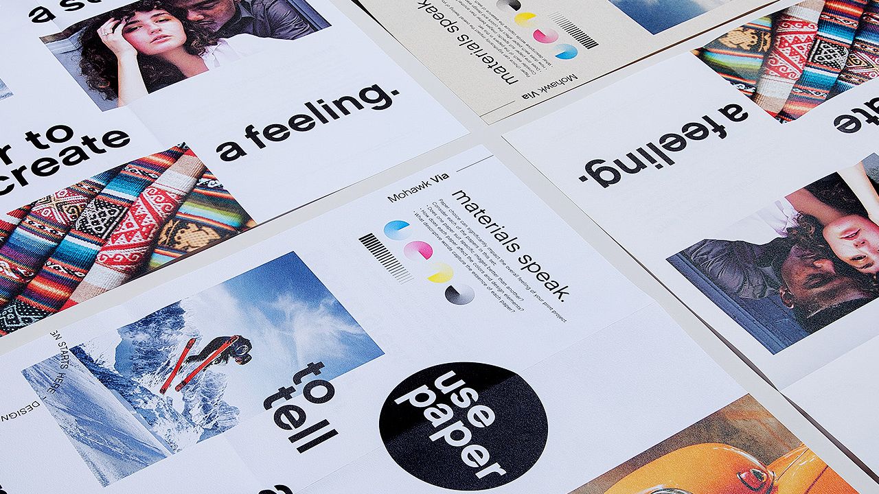
This project is an expanded new version to our first collaboration with Mohawk Paper, which was a folded brochure set that demonstrated how different papers can completely change the look and feel of the same design.
By printing identical artwork across various Mohawk papers, designers could see the impact that paper choice had on a project.
A New Chapter: Version 2.0
For this second collaboration, we wanted to build on that idea and take it a step further.
Version 2.0 highlights select papers from Mohawk’s Via and Superfine lines, allowing designers to see how paper color and texture influence mood, tone, and storytelling.
The goal was simple:
To help designers understand how paper choice impacts their work. Not just visually, but emotionally, and how it can help them tell a brand story.

Designed for Clarity
We kept the format straightforward and intuitive. The piece is a collection of folded brochures held together by a bellyband that prompts the question:
“How does paper choice enhance your design?”
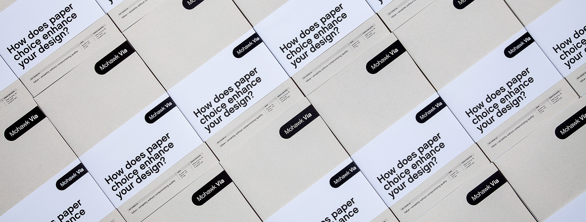
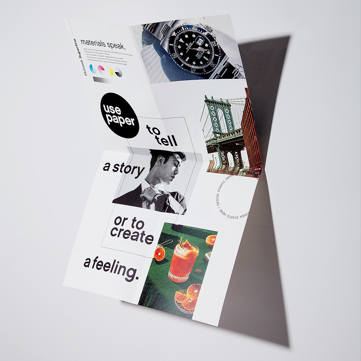
Each folded brochure is printed on a different Mohawk paper stock. The outside of the brochure talks about that specific paper’s qualities, while the inside features a poster design. That poster design is the same artwork across all versions.
This lets you place the brochures side by side and instantly see how changing only the paper can alter the mood, feel, and colors of images and your overall design.
Do you want to design great print and packaging? Our 6-module Print Design Mastery course will guide you through our proven process and go from "new-to-print" to "print design pro". Details here: Print Design Mastery
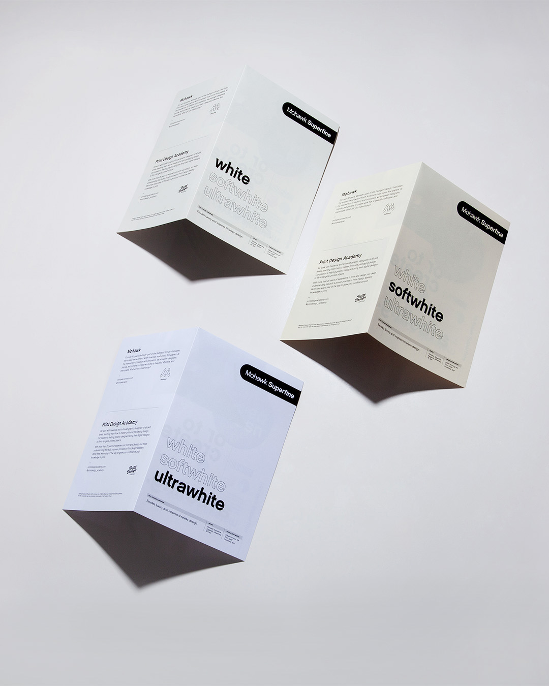
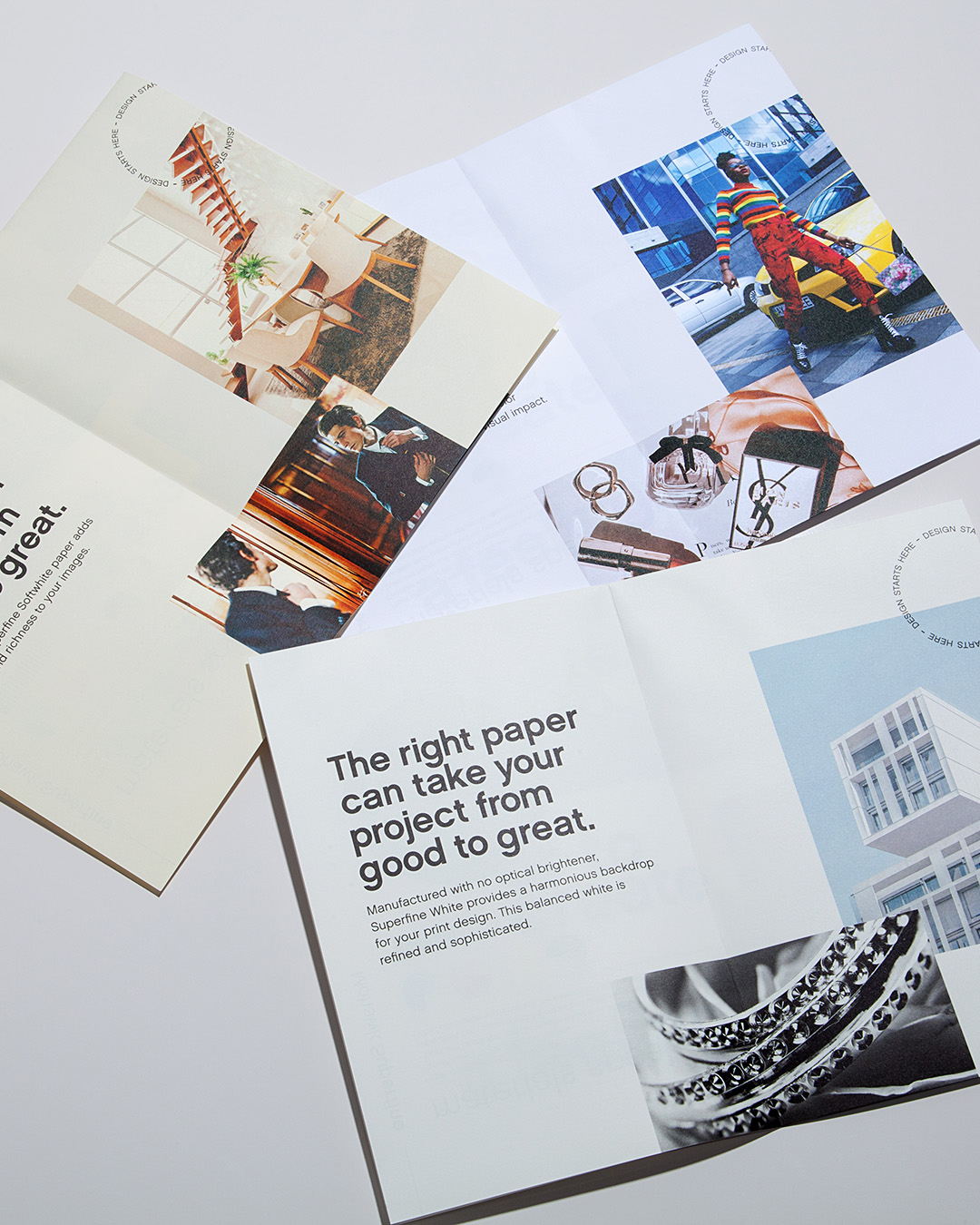
The Superfine Collection
Mohawk’s Superfine line is known for its lush tactility and timeless appeal. It’s basically the gold standard for high-end print.
This set focused on luxury and sophistication, featuring imagery of elegant products, modern architecture, and fashion-inspired photography.
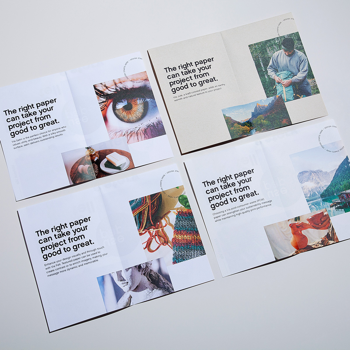
The Via Collection
The Via line is about versatility, texture, and color. It’s a fine paper that’s approachable and expressive.
This collection leaned into playful, vibrant imagery, showcasing the variety and personality that Via papers bring to a printed piece.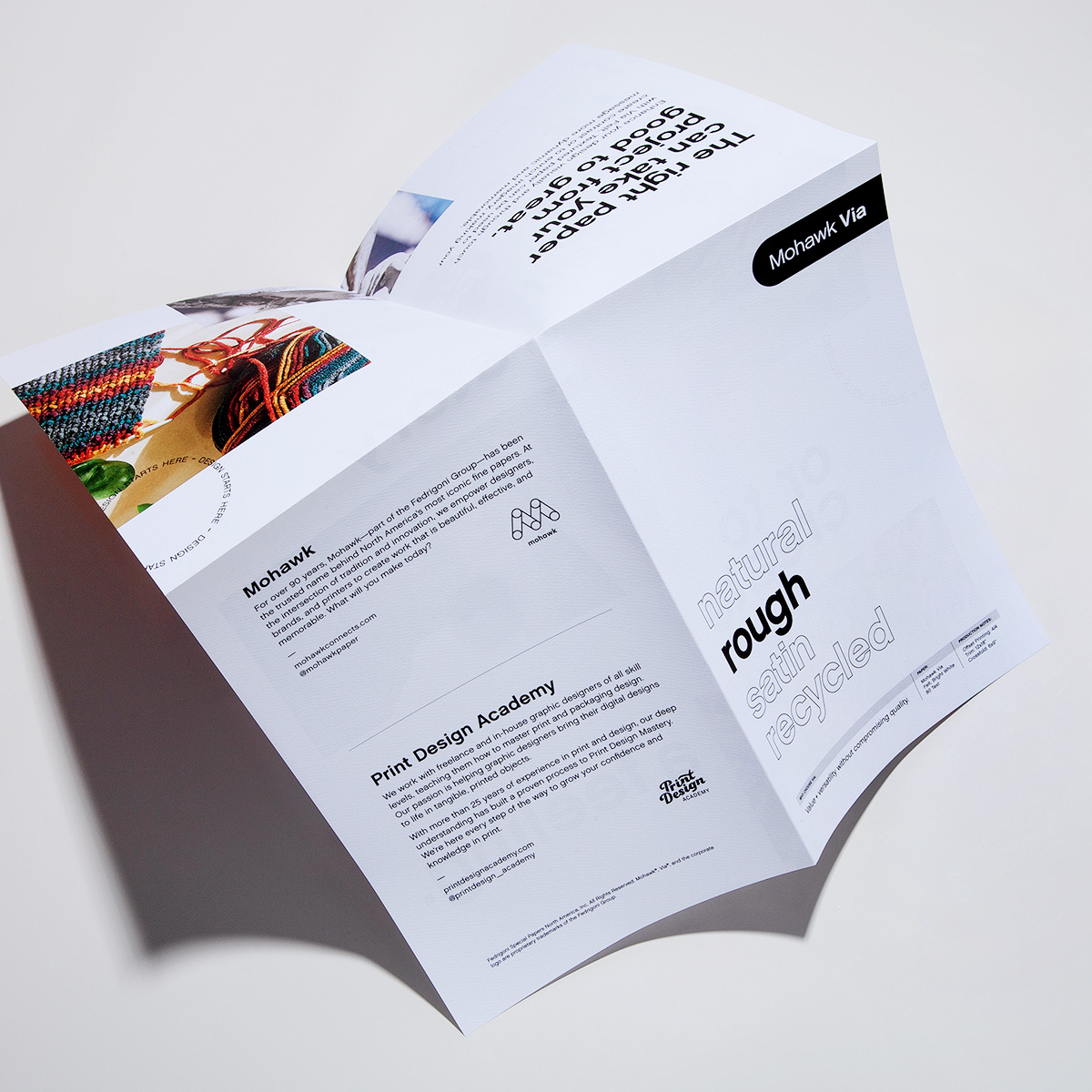
More Than a Sample Set
This project was about creating a piece that didn’t just tell the story of how paper changes things, but shows designers how it affects their design in an easy-to-understand, user-friendly package.
It’s a hands-on, side-by-side comparison that makes the power of paper immediately clear.
Do you want to design great print and packaging? Our 6-module Print Design Mastery course will guide you through our proven process and go from "new-to-print" to "print design pro". Details here: Print Design Mastery
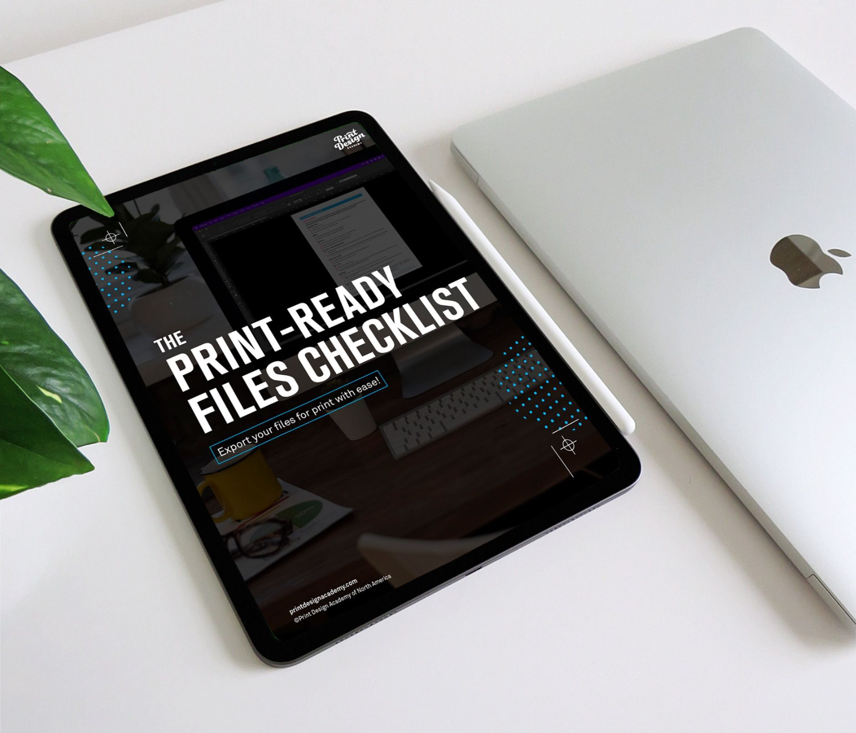
FREE DOWNLOAD
File export made easy with the Print-Ready Files Checklist!