Press Checks aren't that scary. Here are 6 things you should be looking for.
Sep 01, 2021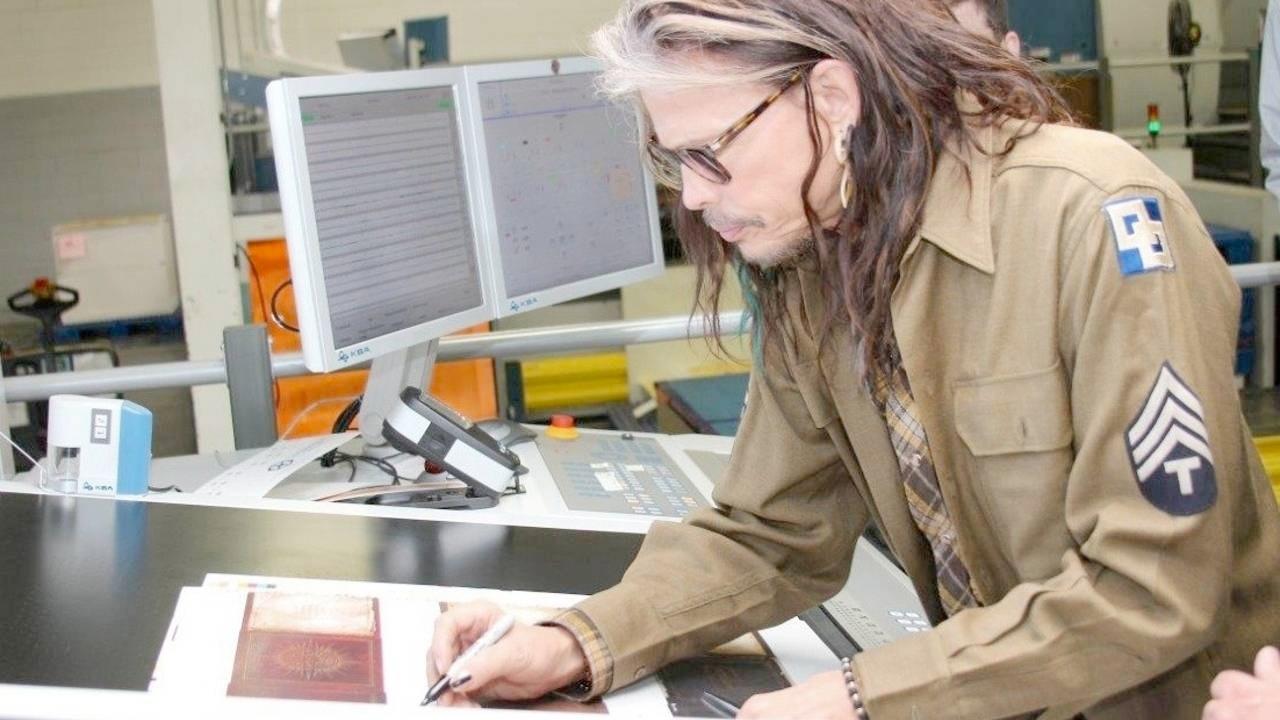
Welcome to the Magical world of press checks. So magical even Steven Tyler wants in on it! Admittedly the photo is a few years old, but it’s still cool.
The exciting and sometimes scary world of putting your signature on that press sheet and giving the approval to RUN IT! There could be 10,000+ sheets printed afterward to match what you signed. That’s exciting!
Maybe you are press checking a re-brand for your customer's packaging, or approving a new design. Maybe a photo book full of incredible photos. Doesn’t matter, print is so exciting! Are you confident enough to sign off on the press sheet?
You should be!
It can seem scary or sound like a daunting task, but it really isn’t. Put it this way, at the time of a press check you will have been through the design process, the file submission process, the proofing process, and you have been through all of them with your client. This is just the final stamp of approval to see and ensure your creative vision is there on the sheet. It might not have been until this very moment that you have seen your design on the correct paper at the press console.
If you’re a designer and you have not done a press check before, or you are a seasoned vet who just needs a press check refresher, this one is for you.
Here are 7 things to be sure you check off your list before signing that sheet.
FIRST: Ask the press operator if they are ready.
They might still be making adjustments and checking on things. Give them the space to get it set for you. There, now you can get started.
The Paper
This one isn’t always as obvious as it sounds. It is highly unlikely that the professionals at your printer would have overlooked this, however, we are all human. Doesn’t hurt to secretly check while you are looking at the sheet and ask if it isn’t obvious.
Should your job be printing on text weight, cover weight, white paper, colored paper, textured paper, gloss paper, matte paper, uncoated paper, synthetic paper, elephant poo paper? Make sure you are looking at your printed images and colors on the correct paper.
Printers often use cheaper “make-ready” sheets to help reduce excess costs and waste. They might set up on a 70# gloss text paper when your project is printing on a 130# Gloss cover. Color can sometimes take 150+ sheets through a press to make a visible change. If it takes 5–10 adjustments in position and color to nail the look you want, that’s a lot of wasted cover stock. This would add hundreds or thousands to the print bill.
Color and position can sometimes change between different papers. So it’s best to do a quick double-check that you are looking at the correct project paper first. Then you can get into finer details.
Color (or Colour)
By this time, you will have seen Hi-resolution proofs showing CMYK color and image resolution. When you get to the press check, stand back and have a look at the sheet. Does the color look visually pleasing? Don’t get too caught up on making sure the press sheet matches the proof EXACTLY, they should be close though.
Also, have a peek at your images to make sure the resolution matches or is better than the hi-res proofs that were signed.
Take the press sheet out of the press table lights (which are 5000k+ and designed to represent true daylight). Look at it in the “room” lighting, and even take it near a window or outside to get the natural outdoor light. For beginner press checking, you are looking for pleasing color. Keep in mind that the majority of printed pieces will be viewed in retail environments, or in an office, not outside in a clear sky with true unfiltered light.
For PMS Colors, check the drawdowns. At the proofing stage, you should request draw downs of the spec’d Pantone colors. There isn’t typically a cost to this and they become part of the proofing process. You are required to sign these off just like the proofs. The press operator will then use these during set up (make-ready if you want to speak printer talk). You can also use the Pantone book, but drawdowns can be done on the exact paper you are printing on and for that reason, can be a better representation of expected results.
So at the press check, do the drawdowns match what is being printed?
Please remember, you OWN that press sheet. Do with it what you please. Another great tip if you have a color that should match on both sides of the sheet is to cut the sheet in half, turn one half around and compare. That color should be balanced and match on both sides of the sheet.
TIP: If there is a specific fabric, item, or anything you are trying to match in print, let the printer know BEFORE proofs are generated. Don’t be that guy walking into the press check with a surprise fabric swatch that needs to be matched. Just don’t.
Flaws or Deficiencies:
Hickies were cool when you were 10…but not on the press sheet. You also don’t want that big rich solid color looking like Grade 8 acne with spots all over.
Do a scan for spots, scratches, and marks that are on the press sheet that shouldn’t be there. The press operator typically takes care of these blemishes before the press check starts, but more eyes are always better.
If you see a scratch or a spot, ask about it! It might just be that 1 sheet, or it might be something that needs more attention. Point them out — eagle eyes. Go ahead and circle them in sharpie on your press sheet! Can’t miss them that way.
Registration / Crop Marks
Registration marks and Crop Marks help with print alignment and cutting alignment in bindery. When you click on the little boxes in InDesign while exporting or packaging your file that tell it to use bleeds and add printers crop marks, this is what it’s talking about.
If you didn’t bring your own, ask for a Loupe(loop). Check all four corners of the sheet and make sure that the crop marks of all colors line up. The crop mark should be black (unless your printing in pantones) and you shouldn’t be able to see any specific color. One on top of the other perfect register makes a black crop mark.
Another good spot to look for registration issues is in any white, knock out, or reverse type. White type is created by just not printing ink in that area. It’s the white of the paper that you are seeing. While looking under a loupe at the type, you shouldn’t be able to see any color creeping into the letters.
The press operator will have looked at this and should have this dialed in. But haven’t you always wanted to look through one of those little loupes and look closer? Feels important. “Press operator, can I use your Loupe”…yeah..
Dielines / Overlay Alignment: Does it all line up?
If your project requires diecutting, scoring, perforating, or folding, during the proofing process there should have been a dieline / overlay to show how the they will line up with the artwork. The press check is your last chance to do a final check of this. Ask for the overlay you saw during proofing and lay it over the press sheet. Make sure they all still line up and that the folds and scores are in the right spot. For packaging also ensure that no critical bleed areas were missed.
If the dieline doesn’t line up correctly, or the layout got mixed up, or a critical bleed is missing, address it now. Once all the sheets are printed, it becomes a much more expensive problem.
Coatings: Like a nice jacket.
If your project is spec’d to have a special coating of some kind, make sure it’s on there before you sign. In some circumstances, this might mean a second press check if the coating is applied on a separate pass through the press.
A coating can change the color slightly on the press sheet and alter how certain colors are viewed and reflect light. Make sure your signed sheet has the coating on it so you are press checking the final color, not something that might change slightly after the coating is applied. This might mean you need to sign ink sheet, and then sign the second pass coating sheet. Another way to confirm what to expect is to ask the press operator and production manager about how the coating will affect the color and images.
Finally, remember, when you are happy, sign that sheet and let the printer do their thing! That press bills by the hour…
BONUS TIPS:
Remember, you own the press sheet, and the press check is as much for your benefit as it is the printers.
Don’t be afraid to pick up the press sheet. Move it around, view it from different angles, view it in different lighting, fold it. You own the sheet, make sure you have any and all questions answered before you sign it.
Projects that are spec’d with laminate — In most cases, you will not be able to take a sheet from a press check and have the press operator wait while the sheet is taken to the laminator to see what it looks like with laminate. For specific colors, have drawdowns of those colors done up, and have the drawdowns laminated. That will show you as close as possible. You can also request to do laminate and other bindery checks.
If you are new to press checks, don’t worry, there are seasoned designers who have been doing press checks for years that still take 10+ minutes to review the sheet carefully and ask questions. Don’t waste time, but don’t feel like you need to rush it.
You know your design and your customer's expectations better than anyone. The press operator knows how to bring it to life.
Team effort for the win.
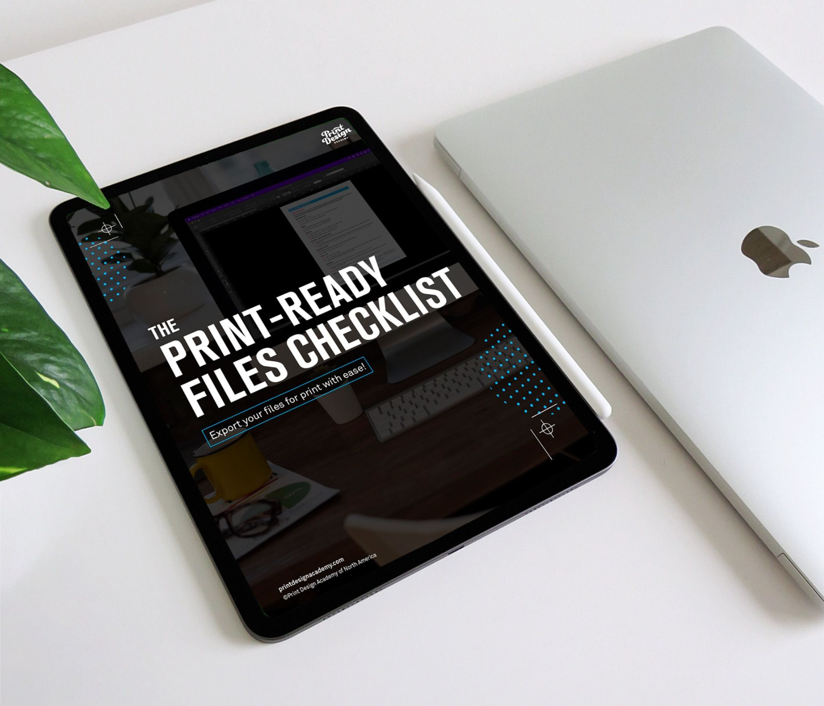
FREE DOWNLOAD
File export made easy with the Print-Ready Files Checklist!