Design Starts Here. | Mohawk Paper Collaboration
May 12, 2025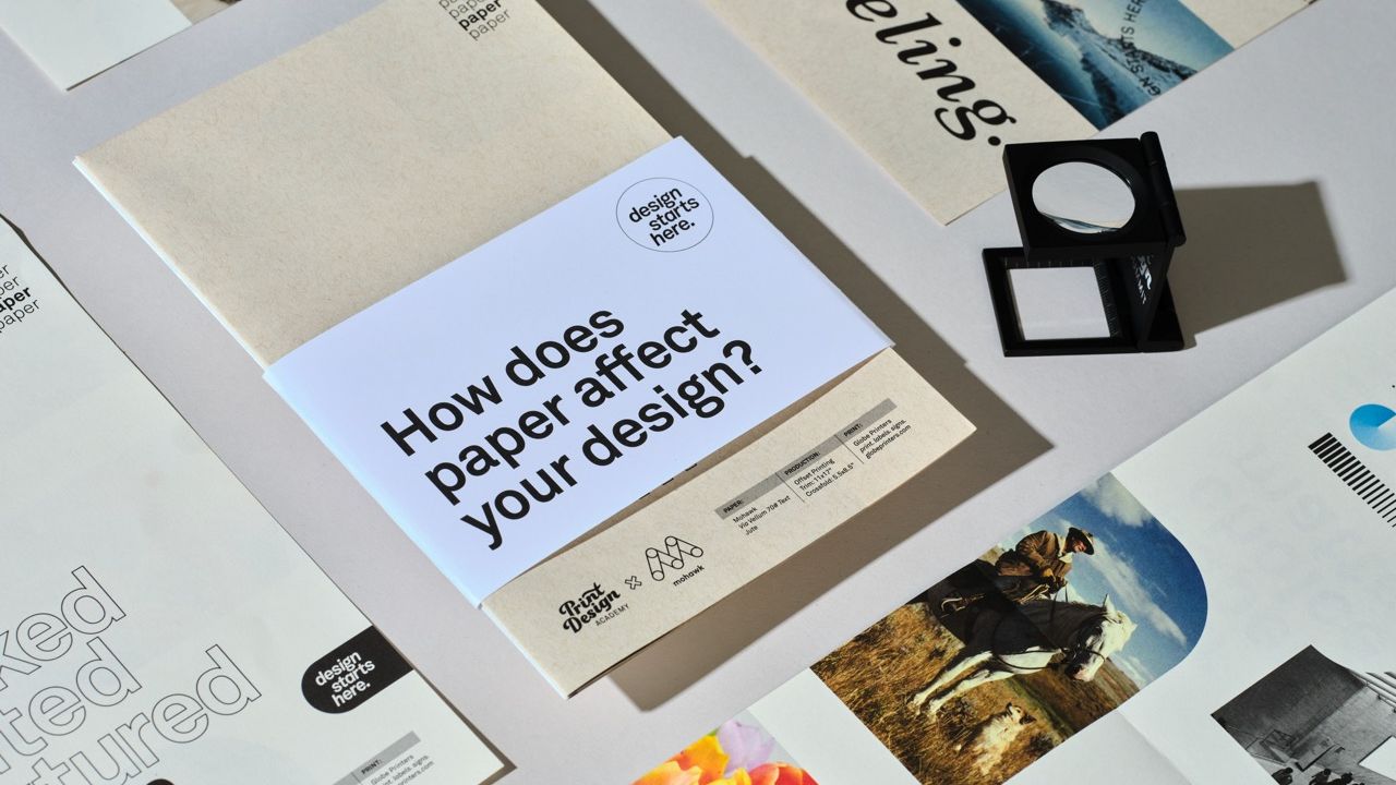
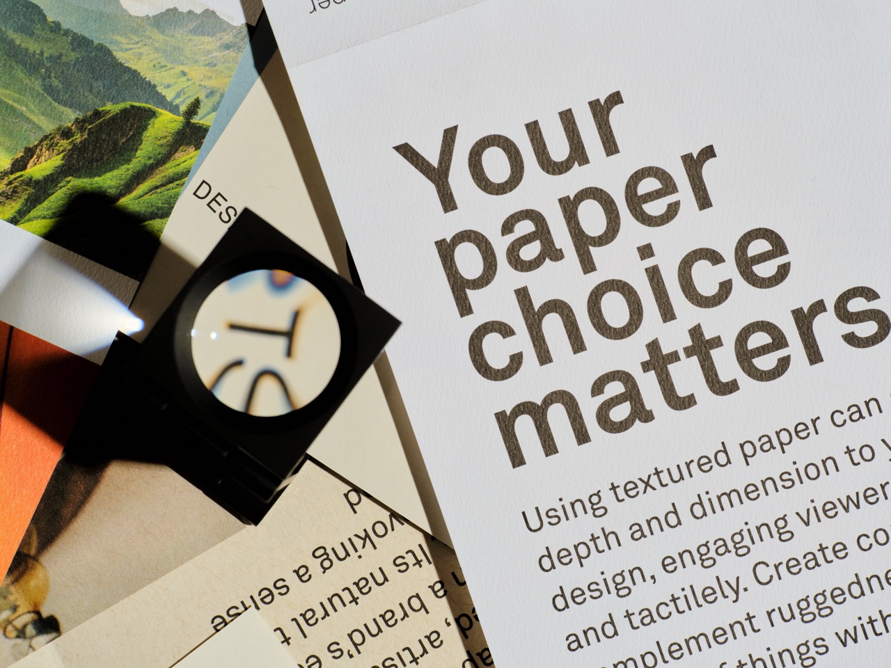
When it comes to graphic design for print, the right paper can make all the difference.
That idea inspired our recent collaboration with Mohawk, a company known for its stunning range of papers in various colors and textures. This project showcased Mohawk’s products while illustrating how paper choices can redefine a print piece’s tone, emotional impact, perceived value, and brand identity.
How It All Started
The collaboration began with a simple idea: paper isn’t just something you print on—it’s part of the design itself. We wanted to create a teaching tool to show how paper colors and textures can shape the overall look and feel of a project. So, we reached out to Mohawk with our idea. Since Mohawk is all about demonstrating what’s possible with quality colored and textured paper, they were on board right away.
Our goal was to create something tangible that we could hand out to designers at the 2024 Creative South Design Conference in Columbus, GA. It was our first time as a vendor at the event, and we wanted to make an impression.
What We Created
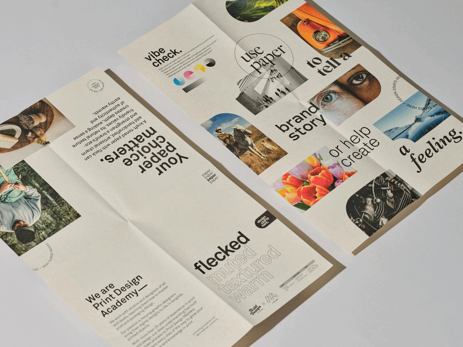
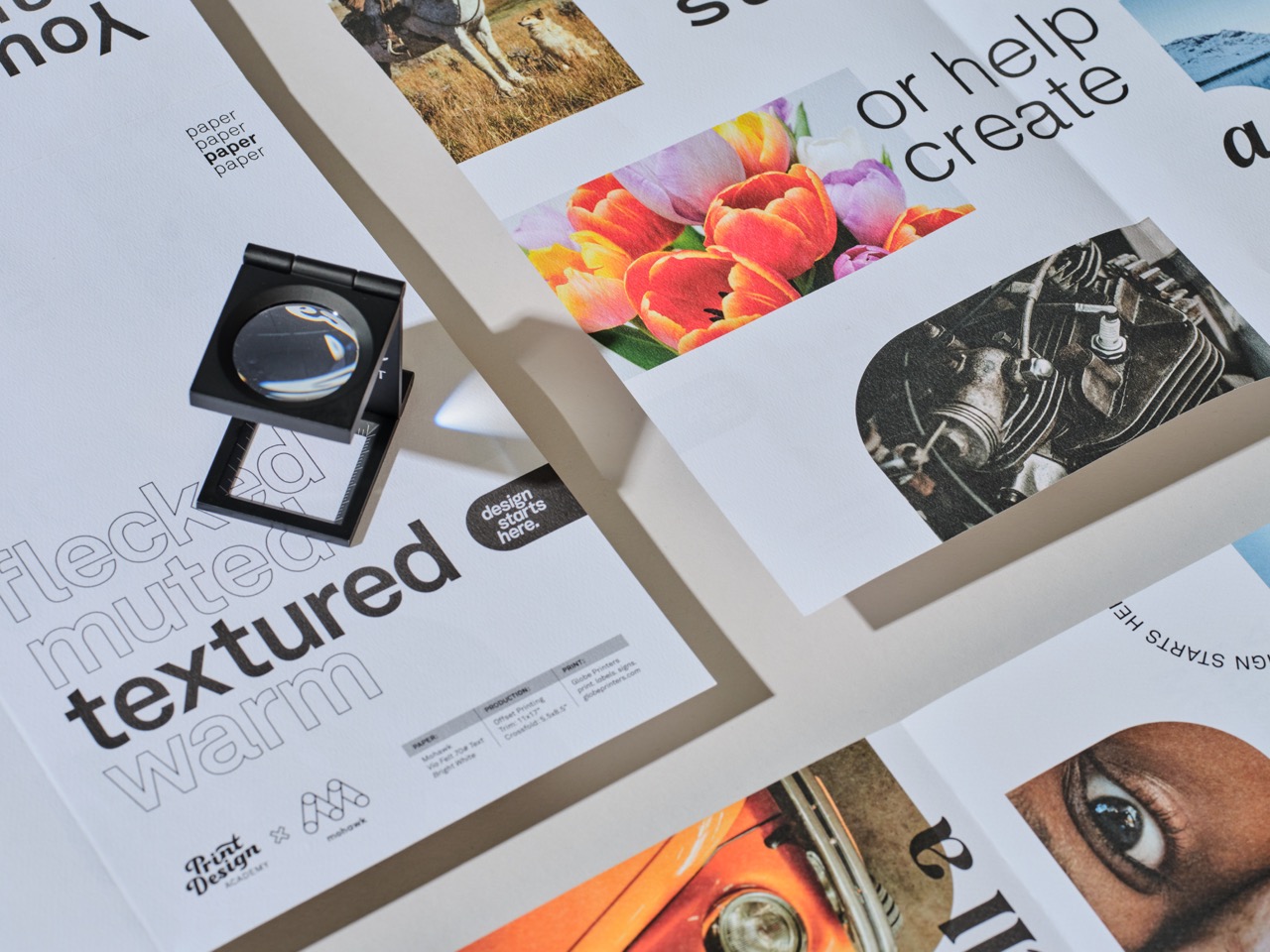
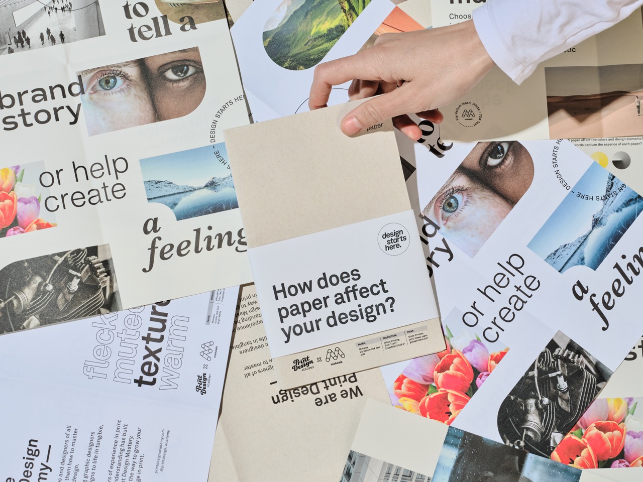
The result of our collaboration is a set of four 12 x 18-inch posters, each printed on a different Mohawk paper. These posters are folded down to 6 x 9 inches, collated into a set, and wrapped with a belly band.
Here’s how it works: the inside of each folded poster features the same design, so you can see how different papers change the look and feel of the same imagery, and even typefaces. On the outside, each poster highlights images that complement the unique attributes of the paper, along with a description of its characteristics.
The Paper Lineup
We carefully selected four Mohawk papers to show off their unique qualities:
- Warm: Mohawk Via Vellum Warm White 70# Text
- Muted: Mohawk Via Smooth Light Gray 70# Text
- Flecked: Mohawk Via Vellum Jute 70# Text
- Textured: Mohawk Via Felt Bright White 70# Text


The four posters are bundled with a belly band, made from Mohawk Superfine, Smooth, iTone, 80# Text. Everything was printed using Process CMYK over CMYK, ensuring consistent results across all paper types. It’s also the most common inks used in print so it showcases real-life scenarios.
The Challenges and Rewards
Creating this piece was both challenging and exciting. One of the toughest parts was choosing the right images to demonstrate how paper affects design. Each paper required imagery that highlighted its unique features while clearly illustrating the lesson we wanted to teach.
Despite the challenges, seeing our first teaching piece come to life in print was incredibly rewarding. The icing on the cake was getting to hand out the finished product to designers at Creative South and seeing their reactions in person.
One other point we’ll add here. Designers - When you are doing any print or packaging design, print out your work at full size before your files are final. During one of our printouts, we realized our type was HUGE. It was hard to tell on screen, but as soon as you printed it…oh wow.
What People Are Saying
The feedback has been amazing. Designers, students, printers, and sales reps have all shared how much they love the project and how important it is for creatives to understand the role of paper in design. It’s clear that showcasing the impact of paper choices resonates with the creative community, and we’re thrilled to be part of that conversation.
This collaboration with Mohawk was an incredible experience, and we’re so proud of what we created together. It’s not just about making something beautiful—it’s about teaching designers how to think differently about the materials they use. And for us, that’s what great design is all about.
Big thanks to the team at Mohawk for their hustle and attention in helping to bring this project to life with us.
Do you want to design great print and packaging? Our 6-module Print Design Mastery course will guide you through our proven process and go from "new-to-print" to "print design pro". Details here: Print Design Mastery
All photos by: Jan Snarski
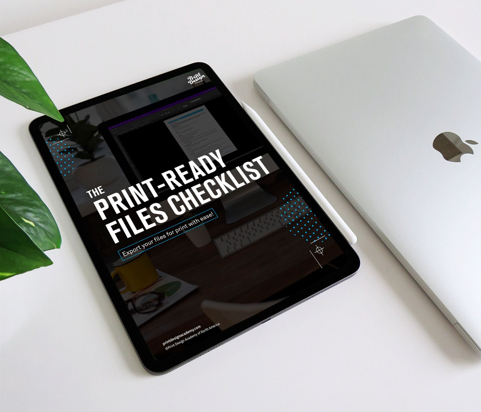
FREE DOWNLOAD
File export made easy with the Print-Ready Files Checklist!