The Top 5 Best Uses for Pantone Colors
Oct 26, 2021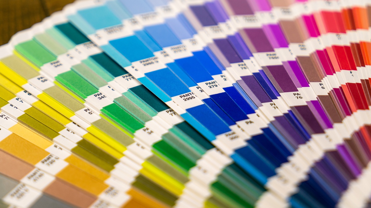
![]()
If you have learned anything about design or even dabbled in the Adobe software, it's likely that you have come across the term Pantone. You have probably seen Pantone's books and color chips or might have even seen them mentioned while working with a brand guideline given to you by your client.
But, do you know the best print situations to use them?
Here are the top 5 print situations to use Pantone Colors.
- Browns - If you are printing a CMYK project and you have large type or headings, or any large coverage areas in your print using the color brown….pick a Pantone to use immediately. A CMYK brown is incredibly difficult for a printer to keep consistent throughout a print run. Browns also can end up looking ‘moddled’ and not smooth. Using a Pantone color will keep much more consistent color throughout the run and print way better.
- Grays - When it comes to Gray, say no to CMYK. Not a bad mantra. When you build a gray out of CMYK, especially a light grey, any fluctuation in Cyan, Magenta, Yellow during the run will drastically shift the shade of grey. Some will be warm, some cool, some yellow-ish, yuck. You are best to select one of the many gray Pantone colors available for a much more consistent and better print.
- Greyscale - One of the common ways that a designer might create a gray is by using a halftone or grayscale. While this can work in some situations, it rarely prints clean and smooth. You would be best in this situation to print a solid gray Pantone color. This will look really clean and vibrant.
- Any bright or fluorescent color - If you envision a bright punch of color in your design, you will want to look at a Pantone color to boost what you are doing. You can choose to print CMYK + a Pantone and use that Pantone to boost a particular area in your design, or just use 100% of that Pantone.
- Large coverage ink areas - One thing I see a lot in print, is designers wanting a flood of color on a page with one text element, or even a full page of color used as a divider in a booklet design. If you have a page of solid color, you will want to use a Pantone. This will print cleaner than a large solid of CMYK. Another tip...if you are creating a large solid color like that, do a double hit. It's like 2 coats of paint on a wall...it looks better.
- BONUS: If you are printing a multi-page booklet with the same color header or same color text or illustration elements throughout. You will want to use a Pantone. A Pantone will be a huge help and make it much easier for the printer to match that color throughout the pages of the book. As all the elements won’t be printing on the same sheet, or at the same time, it can help with consistency.
Use these tips as a guide the next time you are planning a print project. They will help you set it up for success right from the start.
And remember, if you a branding designer, you definitely need to include Pantone colors for both uncoated and coated papers in the brand guidelines you create. Paper textures interact with how colors look and it's why Pantone created these different versions for you.
FREE DOWNLOAD
File export made easy with the Print-Ready Files Checklist!